Adding & arranging widgets
Widgets are the pieces you drop on a page. This chapter covers placing them, moving and nesting them in the tree, and configuring them through the schema-driven properties panel.
Place a widget
- Open the picker — Right-click a page or a container in the widget tree (or click the
+on the row) and choose Add Widget/Component…. A searchable drawer opens with one card per type — icon, name and description — grouped by category, each badged Built-in, Custom or Component. - Pick a type — Search by name or scan the categories, then click the card — say Button or Icon. It's inserted into the tree at the point you clicked and selected for you.
- Position it in the tree — Use Move up / Move down or drag the row to set stacking order, and drop it inside a Container to nest it. A placed Component that declares slots hosts widgets the same way — one group per slot in the tree (slots →).
- Configure it on the right — The properties panel now lists exactly the fields this widget declares. Fill them in — many can be bound to live data instead of typed literally.
Don't know the name? The picker searches names, types and descriptions, so typing part of what you're after is enough — the drawer is the only way to pick a type, so there are no sub-menus to scan.
Containers are added their own way. A Container has its own Add Container menu item rather than living in the widget list, because it's the thing that hosts other widgets. Drop widgets into it to build layout — see Layout.
Schema-driven properties
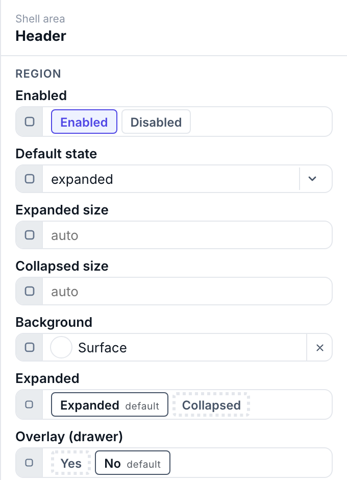
Every widget declares a schema — the list of fields it exposes and the type of each. The panel renders the correct editor per field, so you never type a color into a text box:
- a
colorfield opens a color picker (with theme-token support), - an
iconfield opens the icon picker, animagefield the asset picker, - a
selectshows a dropdown of allowed values, - a
structfield (like a Button's bound variable) exposes its members to bind individually.
Most fields also carry a small source pill — that's where a static value becomes a live binding. Full detail in Dynamic properties.
Make controls do something: actions
Interactive widgets (Button, Menu Toggle) have an Actions field holding a list that runs, top to bottom, when the control is pressed. The thirteen action types cover four jobs:
- Screens — open or close a dialog, or open an ordinary page as a page overlay.
- Machine — write a variable (set a coil, a mode, a setpoint), or load / save a recipe.
- Session — log a user in or out.
- Interface — switch language or theme, raise a toast, or put a confirm alert in front of a dangerous write.
The five that cross the wire carry onSuccess / onFailed / onSettled handler lists, whose actions can read the outcome with $result. Full catalog, fields and worked examples: Actions & events.
Moving between pages is not an action. Navigation widgets read the page tree instead — see Pages & navigation.
Visibility & permissions. Every widget exposes Visible and Interactable booleans. Set either one's source to $userGroups and it becomes a group test — a Start button restricted to operator renders read-only for everyone else, with no scripting. See Users, groups & permissions.