Widgets & styling / Theming
Theming
Colour, type, spacing and radii are defined once as tokens and every widget reads them. Restyle the whole project — or match a customer's brand — without touching a single page.
How theming works
Widgets never hardcode a colour or a font size; they reference theme tokens (the --hmi-* custom properties). Change a token in the Themes area and every widget that uses it updates at once. A widget property only overrides the theme when you deliberately set it — leave it unset and it tracks the token.
Set up a theme
- Open the Themes area — Pick Themes in the editor's left rail. Tokens are grouped — colours, typography, containers, and more.
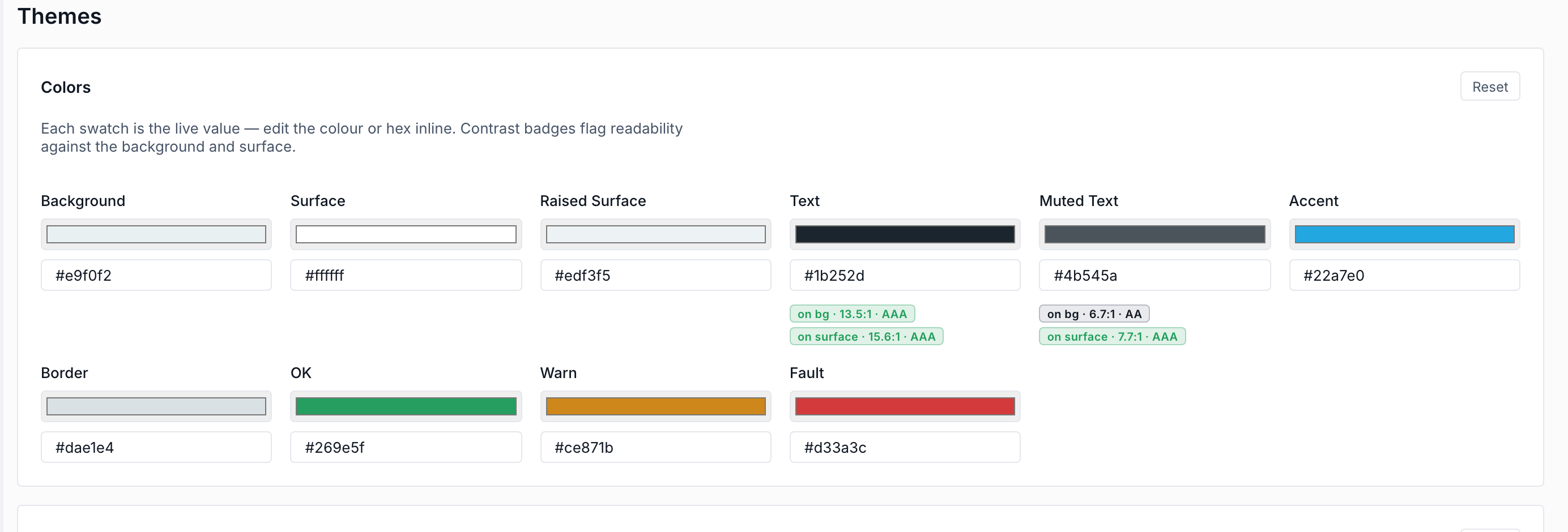
- Set the core colours — Define bg, surface and text, plus your accent. The editor shows live contrast checks (text on bg, text on surface) so you keep it legible.
- Choose typefaces — Pick a UI font and a mono font. Several are bundled ready to use — Inter, Manrope, Lexend, and Roboto Mono / JetBrains Mono.
- Dial in shape & spacing — Set the base radius and spacing tokens so cards, buttons and inputs share one consistent feel.
Because the theme is just tokens on disk, you can keep per-customer themes in version control and swap them per deployment — same pages, different brand.