Pages & navigation
Pages are the screens operators move between. They live in a tree of pages, page groups and dialogs. This chapter walks through building that tree and giving operators a way to navigate it.
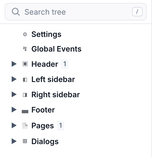
How the tree is organised
Open the Editor area in the left rail. The tree is a fixed set of collapsible sections, each with a + on its row:
| Section | Holds | + adds |
|---|---|---|
| Header ▣ · Left sidebar ◧ · Right sidebar ◨ · Footer ▄ | The shell regions that wrap every page — see Layout. | a widget to that region |
| Pages | The screen tree operators navigate. | a page or a page group |
| Dialogs | Modal overlays, not part of the page tree. | a dialog |
Add your first page
- Add it — Click the
+on the Pages section row, or right-click inside the section and pick Add Page. A blank page appears, selected, with its properties open on the right. - Name it — Set the page title in the properties panel (or double-click the tree row to rename). The title feeds the browser tab, the
$pagesource, breadcrumbs and menus. - Fill in the details — Give it an icon, a breadcrumb label, and a description as needed — navigation widgets read these automatically.
Group, nest, and reorganise
The tree's right-click menu is where structure happens, and it changes with what you clicked. Use it to keep related screens together and to reshape the hierarchy as the project grows.
| Menu item | Where | What it does |
|---|---|---|
Add Page |
Pages section, page group | Create a page — at the root, or inside the group you clicked. |
Add Page Group |
Pages section, page group | Create a page group — a container that stacks its own pages and gets its own navigation. Groups can nest. |
Rename · Cut · Copy · Paste |
pages, groups, dialogs | The usual edits; paste drops a copied page (and its widgets) in place. |
Delete Page · Delete Page Group · Delete Dialog |
the matching node | Remove it. |
Moving things. Drag a row onto another: the top or bottom quarter drops it before or after that row, the middle half drops it inside — into a page group, a container, a page section, a shell area or a dialog. Hovering a collapsed row for a moment opens it, so a drag can reach anywhere without preparing the tree first.
Cut (Ctrl/Cmd+X) then Paste does the same move from the keyboard, and both
keep the node's id — bindings that name it keep working. Copy + Paste is the
opposite: it duplicates, giving the copy fresh ids. Either way the move is a single
undo step.
Dialogs are added from their own section, not from the page right-click menu — click the + on the Dialogs row. They live outside the page tree because they open over whatever screen is current rather than being navigated to.
Page groups vs. dialogs. A group is for sets of sibling screens that share a navigator or tab bar (e.g. a wizard, or one screen per machine). A dialog is for a focused, dismissable task on top of the current screen (confirm, set a value, show detail).
Dialogs, and passing values into them
A dialog is built exactly like a page — a widget tree, edited on the same canvas — plus a few of its own properties: a title, whether a close button shows, and whether clicking the backdrop closes it.
What makes a dialog reusable is that it can declare input properties, the same mechanism a Component uses. Declare motorId on the dialog, and the widgets inside read it with $componentProp; the Open Dialog action that opens it fills the value in. One "Motor detail" dialog then serves every motor on the plant instead of one dialog per machine.
The opening action also decides how it looks — size (auto / small / medium / fullscreen / fixed pixels), placement (centred, edge-docked, or anchored to the button that opened it, popover-style), and whether the backdrop dims. See Actions.
Page overlays: reuse a page as a modal
Sometimes the thing you want on top of the current screen already exists as a full page. Rather than rebuild it as a dialog, open it with the Open Page Overlay action: the page renders as a modal, with the same size, placement and backdrop choices, and closes with Close Page Overlay.
Rule of thumb — a dialog is authored to be a popup and can take input properties; a page overlay is an existing screen borrowed as one.
Give operators a way around
You don't hand-wire links. Navigation widgets read the page tree and stay in sync as it changes. Add whichever fits the layout:
- Navigation Menu — A sidebar or top-bar menu that mirrors the page tree automatically. Choose orientation, icon/label display, flat vs. tree hierarchy, and how sub-menus expand.
- Tab Bar — Switches between the sibling pages of a group as tabs — ideal inside a page group.
- Breadcrumb — Shows the trail of pages leading to the current one, with an optional home icon.
- Page Navigator — Back / forward / up controls scoped to a page group's navigation stack.
Put these in a shell region (see Layout) so they persist while operators move between screens.